Motivation for Rave
The volume and availability of data in our lives are greater than ever before and are growing rapidly. We are faced with an increasingly demanding and complex need to make sense of this data in order to inform decisions related to many fields, including product design, systems engineering, public policy, and economics. To this end, new multidisciplinary decision support methods are now being developed that incorporate aspects of information visualization, optimization, statistical analysis, and surrogate modeling. Any particular problem may require only a small subset of the available methods, but the few that are chosen will vary from problem to problem, and person to person. Consequently, implementing decision support methods into a decision making process requires an agile and adaptable framework that encourages exploration and creativity and that can accommodate the needs of a diverse set of problems and decision makers. Such a framework is also desirable from the perspective of decision support method researchers so that they may easily integrate their newly created methods with existing methods.
We developed Rave as a framework to explore these issues. Rave is built to be easy to use, whether you want to visualize a data set, optimize a function, or create an interactive information dashboard. Rave is also built to be easy to extend; new capabilities can be coded using specified interface templates, and then just by adding them to Rave's directory structure they will be available for you to use in Rave.
Quick Facts about Rave
- Why "Rave"? RAVE was originally an acronym, but as the program grew, the acronym lost its relevance, so now it's just "Rave." The tagline "Reimagining the Analysis and Visualization Experience" now appears on the splash screen, but this is not intended to be what Rave "stands for."
- Rave is coded in MATLAB, with a few bits of Java mixed in for the very small subset of things that cannot be done purely in MATLAB.
- You can use Rave with any "flat" text data file, or with MATLAB functions that generate data.
- Rave's main capabilities are interactive visualization, and optimization.
- Additional capabilities, including surrogate modeling, statistical analysis, and design of experiments, are being implemented too.
- Each graph, optimizer, etc. that Rave can use is coded as a "plug in". This system lets users expand Rave's capabilities by coding new methods and just dropping the code in Rave's directories without needing to modify Rave's source code.
- Rave comprises over 38,000 lines of code (excluding comments and empty space) in over 1500 functions.
A Tour of Rave
This section introduces some of Rave's features by taking you on a guided tour.
The Workspace
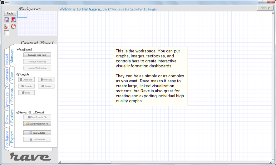
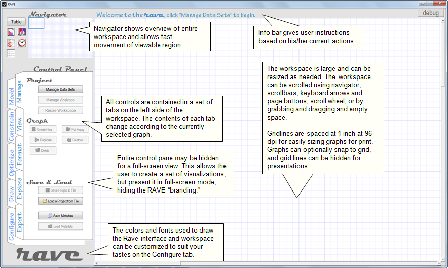
The main Rave view, which you will see when you first open Rave, is called the "Workspace." Think of it like a large blank canvas on which you can arrange graphs, images, text, and controls to create interactive visualizations. Of course, your arrangements don't have to be so complicated. You could create just a single graph, or just use Rave to run an optimizer without putting any objects on the workspace.
Working with Data Sets
All of the information you work with in Rave must be arranged in a "Data Set". A data set is simply a collection of variables you are interested in (the column names of the data set) and the corresponding data points you have observed (the rows of the data set). In Rave, you load your Data Sets from .txt, .csv. or .xls files. Once you've created a Data Set, you can load functions that act on the data to calculate new variables, which will subsequently also be included in your data set. So the data set you initially load from a text file contains your "independent" variables, and you can later add "dependent" variables to your data set by loading functions that act on the independent variables.
Data Sets are loaded from the "Manage Data Sets" window, which is shown below. This will always be your first stop when you being a new Rave session.
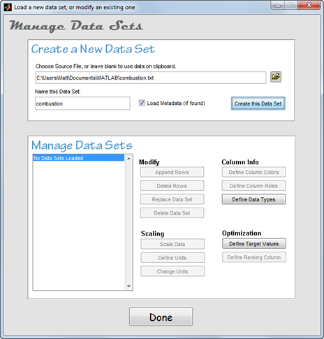
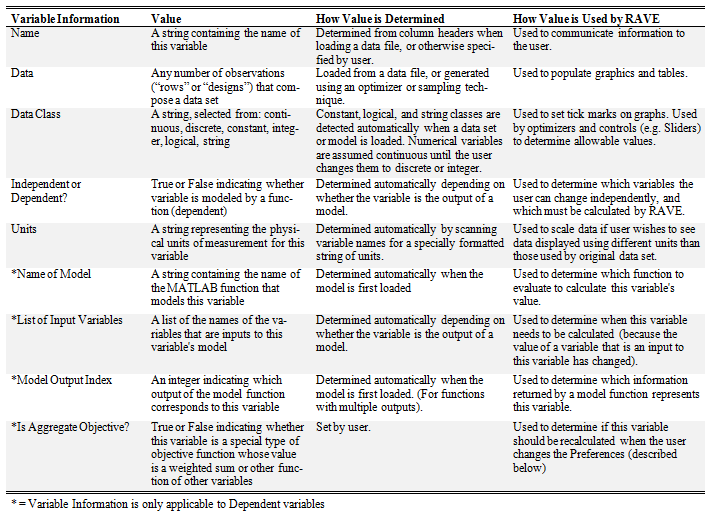
When you load a data set from a file, in addition to just tracking the values, Rave analyzes the data set to determine some additional useful information about your data set. This helps Rave figure out how to treat your data when performing different tasks. The table below shows the information that Rave tracks and how it is used.
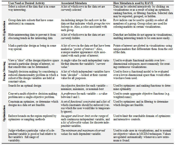
In addition to Data Sets, Rave organizes additional information using a system called "Analyses." The idea behind Analyses is that you might want to perform several related tasks that all use the same data set or you might want to perform several unrelated tasks that use the same data set. Analyses are a mechanism for you to organize your work to tell Rave which of your tasks are related to each other, and which are not. Thus, Analyses keep track of additional information about how you are using a data set. You can create as many Analyses as you need, regardless of how many Data Sets you are working with. The information that each Analysis knows is called "metadata" in Rave, and is listed in the table below.
Since the metadata is not stored in the text file or MATLAB functions that comprise the Data Set, Rave lets you save metadata separately into a specially formatted text file. This lets you maintain your metadata between Rave sessions. Note that you can also save your entire Rave session into a .rve file and pick up exactly where you left off.
The information listed in both of the above tables is always auto-generated when you load a new data file or create a new Analysis. Rave determines default values for each parameter based on your data set, and you can change them later if you need to. This way, Rave avoids bugging you to specify values for metadata that you don't intend to use.
Visualization
The first thing you'll probably want to do after you load a data set is to see what your data looks like. Rave groups visualizations into six categories, which are described below on a screenshot of the Create New Graph GUI.
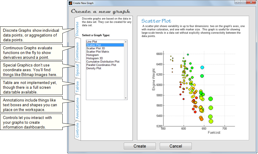
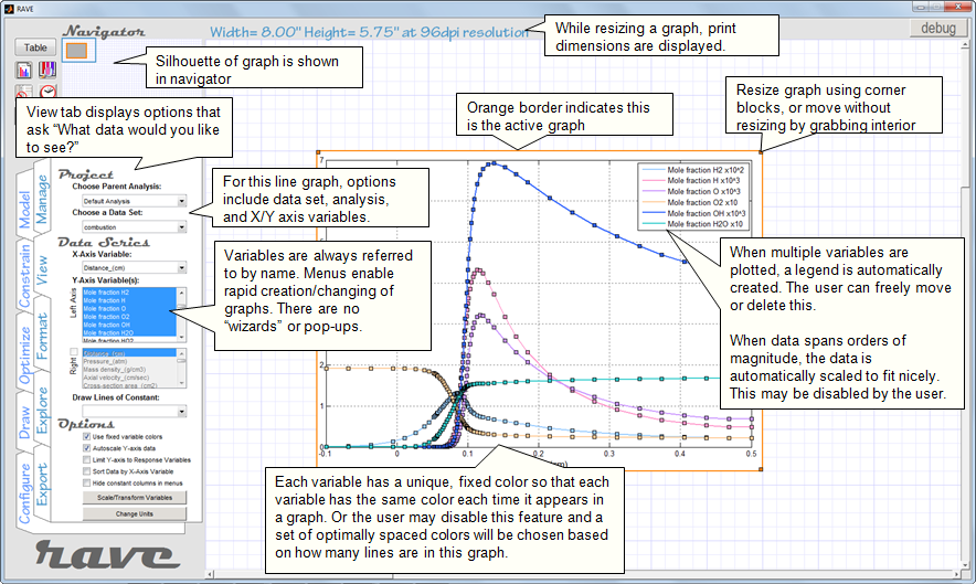
To create graphs (or other types of visualizations), you simply choose the desired graph from this GUI and then click and drag on the workspace to place/size the graph. The screenshots below explains some features of the workspace after a line graph has been created.
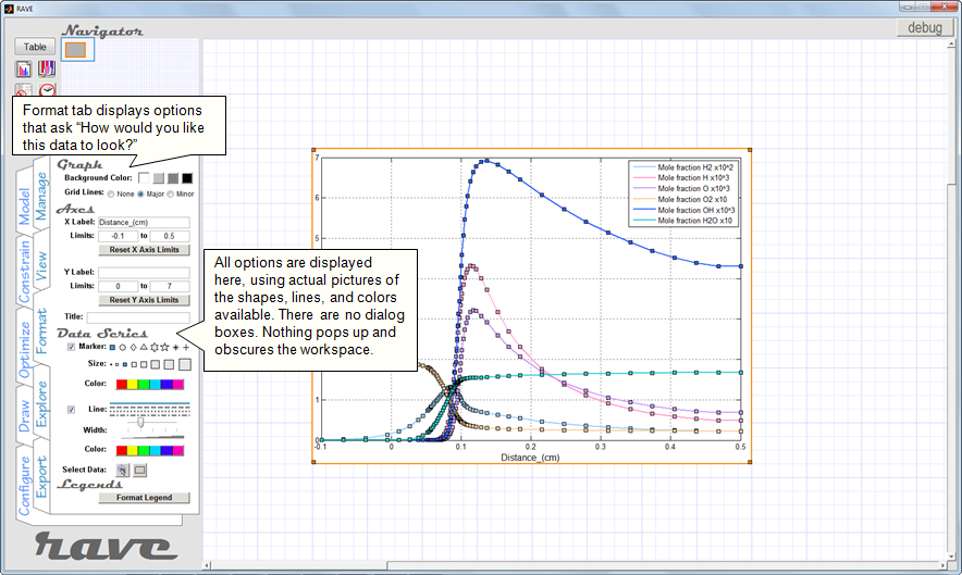
Visualizations are primarily controlled using the View and Format tabs on the left side of the screen. Each of these tabs is customized for each type of visualization to only show you options that are relevant to whichever graph you currently have selected. The View tab gives you options related to which variables in your Data Set to display in this graph, while the Format tab gives options related to how the data should look.
Interacting with Discrete Graphs
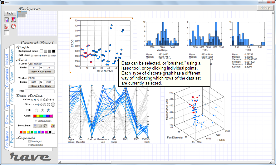
Discrete graphs, which include things like scatter plots and histograms, are most often interacted with by "brushing," or selecting, the data with the mouse. The screenshot below shows an example of how different graphs incorporate brushing. The scatter plot lets users select data using a "lasso" tool or by directly clicking points. The histogram lets users select data by clicking bars. The parallel coordinates graph lets users select data by using slideable filters on the range of each variable.
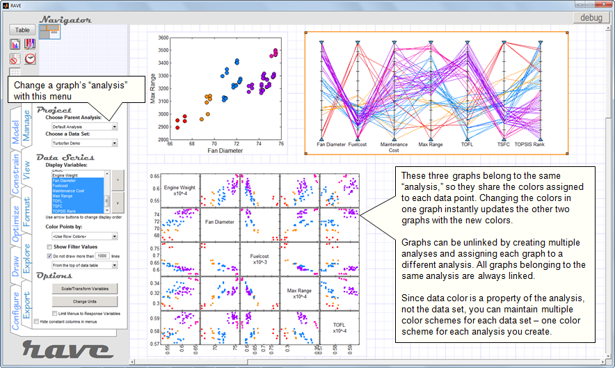
Note that each of the four graphs in the screenshot below shows the same data selected. This is because all four graphs are assigned to the same Analysis, so changes made to any one of them affect all of them. (Recall from the table above that data selection is a property tracked by Analyses.)
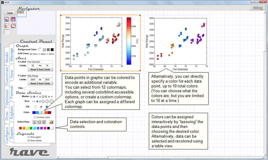
Once you have selected a set of data points, those points can be assigned a unique color to help distinguish them as being special in some way. The screenshots below show how users can specify data colors, and how data coloration is shared between linked graphs.
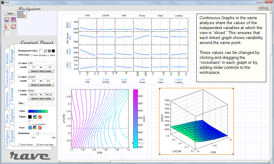
Interacting with Continuous Graphs
Continuous graphs show "slices" of a function in a plane that passes through a specified point. Depending on whether the graph axes are independent or dependent variables, different graphs are formed, including contour plots, carpet plots, surface plots, and prediction profilers.
The primary mechanism for interacting with continuous graphs is to change the location of the point that the slices pass through. This can be accomplished by using slider controls, or by directly clicking and dragging crosshairs on some types of continuous graphs. The screenshot below shows some examples of linked continuous graphs.
Combining Discrete and Continuous Visualization
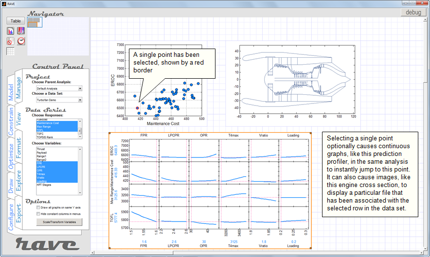
Because continuous visualization shows variability around a single point of interest, continuous graphs can be linked to discrete graphs by having the continuous graphs set their point of interest to a data point that has been clicked in a discrete graph.
An example of this is shown in the screenshot below. Here, clicking a point in the scatterplot causes the prediction profiler to show the partial derivative variabilities of the selected data point. The linked image (a discrete graph) also updates to display a file that has been associated with this point in the data set. Notice that the (blue) values listed as the current values of EROC and Maintenance Cost in the prediction profiler match the coordinates of the point that is selected in the scatter plot. The values listed along the horizontal axis of the prediction profiler show the settings of the independent variables that correspond to the selected point.
Working with Constraints
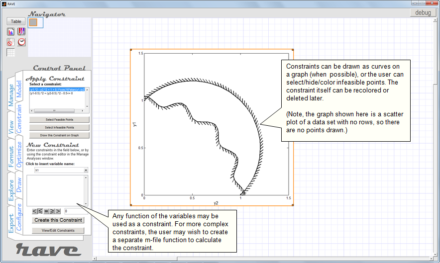
Depending on your application, it might make sense to define functions of your variables to serve as constraints to help you filter data points, or optimize functions within allowable limits.
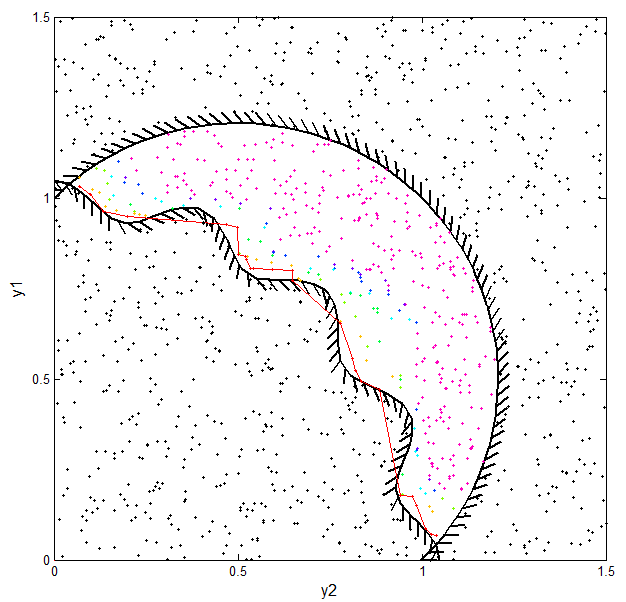
Rave lets you define algebraic functions of your variables to serve as inequality constraints (equality constraints are not yet explicitly implemented). Once you've defined constraints, you can draw the feasible region on your graphs or select the data points are feasible or infeasible. The screenshot below shows an example problem with two inequality constraints that create a bounded feasible space.
Optimization
If you're working with data-generating functions, you may want to let an optimization algorithm generate "good" data for you instead of supplying Rave with a pre-determined data set to visualize.
Rave currently implements the optimizers in MATLAB's "Global Optimization Toolbox" and a custom implementation of the NSGA-II algorithm that does not require you to own any MATLAB toolboxes. (Support for the optimizers in MATLAB's Optimization Toolbox will be added in the future, and users can also implement their own algorithms.) Rave includes three categories of optimizers: single-objective, multi-objective, and ranking methods (for ranking points in a data set when no executable function is available.)
The screenshot below shows the Optimize tab, which lets you select algorithms, constraints, and objectives, as well as set the parameters specific to the particular algorithm you have selected. There are options to let you animate the optimizers progress on a scatter plot (and to save the animation as a movie) and options for exporting the results or appending them to your existing data set.
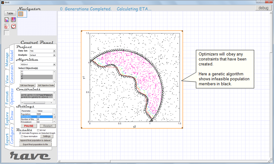
The animated gif below was exported directly from Rave. It shows the problem illustrated in the screenshot above: constrained multi-objective optimization using the NSGA-II algorithm. The objective is to simultaneously minimize y1 and y2 while obeying the plotted constraints.
(The animation is shown slightly faster than real time. Each frame shows one "generation" (iteration) of the algorithm. The data points are colored according to their "domination rank," a concept used by NSGA-II to define optimality. Rank 1 points are red, and notice that by the end of the loop almost all of the points are red. The red line connects these points to draw the Pareto frontier.)
Exporting Graphs
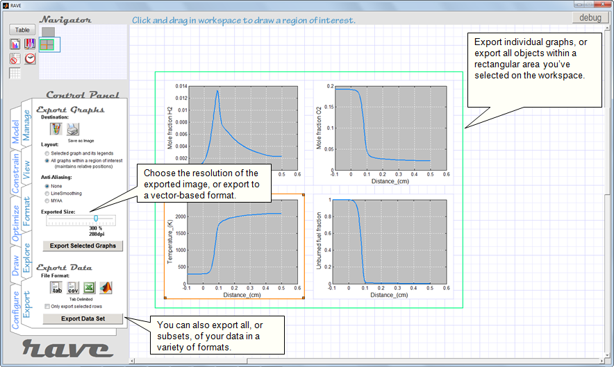
Once you create some cool visualizations, you'll probably want to export them to files that can be used elsewhere. Sadly, many programs used for visualization are surprisingly bad at exporting graphics. We understand. Rave lets you export graphs in four ways:
- As pixel-based images (png, jpg, bmp, tif, gif), great for on-screen display. Rave lets you choose the resolution of the exported graphic, so you can get much higher quality results than what you see in Rave. You can even anti-alias your exported graphs.
- As vector-based images (eps, ai), great for printing and fine-tuning in Adobe Illustrator.
- As MATLAB figures, so you can fine-tune them in MATLAB before making your final export to an image file.
- As pdf files, great for all the things pdfs are great for. (Note: You must have Ghostscript installed to use pdf export.)
Rave lets you export individual graphs from your workspace, or you can select a rectangular region of the workspace and export everything within that region to a single image file. (Unfortunately there are size limits to what MATLAB lets you export, so I haven't yet found a way to export the entire workspace to one file.) The screenshot below shows the Export tab being used to export an arrangement of four line graphs.
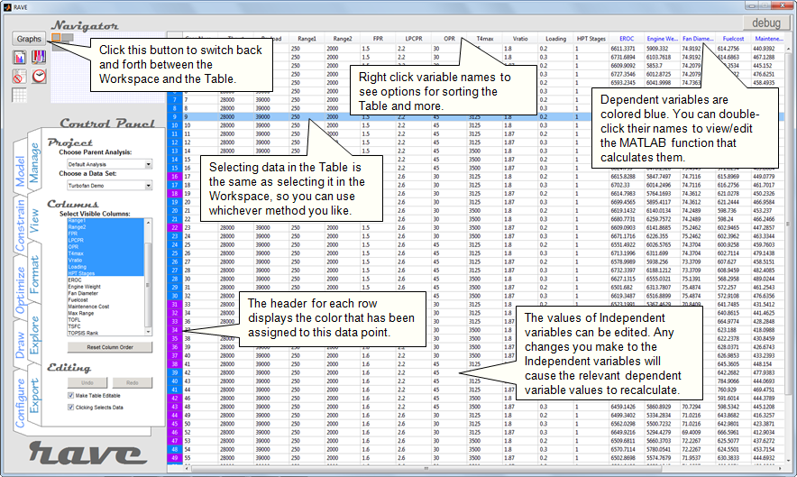
Working in Table Mode
Sometimes it's easier to understand your data by looking at the numbers themselves. As an alternative to using the Workspace to visualize data, Rave offers a Table mode that lets you see exactly what's in your data set. The screenshot below shows the Table and explains some of its features. (Note: Table Mode is one of Rave's newest features, so it still lacks many features you'll want it to have. They'll be there soon.)