Density Plot
Contents
Overview
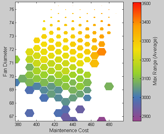
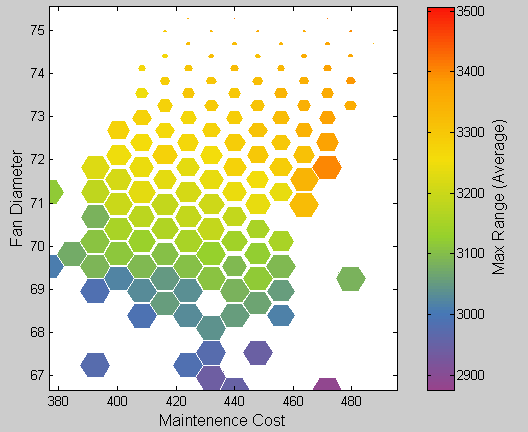
A density plot is similar to a scatter plot, but instead of plotting each point, an invisible grid is overlayed on the graph, and all points within the same grid bin are represented by a single marker whose size is proportional to the number of points in that bin. This technique is useful for large data sets when data density is important, or when a scatter plot over-complicates the representation. Markers may optionally be colored according to the average value of some measure of the points in the corresponding bin.
This type of graph was originally described in "Scatterplot Matrix Techniques for Large N" by Carr et al. Journal of the American Statistical Association No.82, 1987, pp. 424-436
The cells of the density plot can be sized according to:
- The number of data points within each cell
- The average value of some variable, taken over all data points within that cell
- Or cells may be drawn at a uniform size
The cells can be colored according to:
- The number of data points within each cell
- The average value of some variable, taken over all data points within that cell
- The most common row color, taken over all data points within that cell
- Or all cells may be drawn in the same color
Cell Sizing/Coloration
- When sizing cells according to some value (the "count"), the area of each cell is proportional to the count. This means that the cell length/width is proportional to the square root of the count. Although this is generally considered to be the preferred way to use area to represent a count, the ambiguity may be confusing (i.e. some viewers may think that the length/width is proportional to the count).
- Note that the maximum cell size is determined by the maximum count, and the minimum cell size is also related to the maximum count (i.e it is a constant fraction of the maximum size). In future versions, new Format tab options will allow control of these.
- When coloring cells according to data density, the color (as drawn on the color bar) is proportional to the count.

